Monday, January 23, 2006
Sharp and Smooth
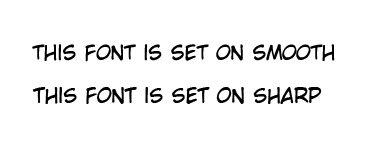
There is a bit distinctive different between setting the font on "smooth" and setting it on "sharp."
e.g.
You might not be able to see the different on the picture but smooth text tend to blend in with the drawing. As compared to sharp, the text itself looks a bit brittled.
e.g.
Smooth Fonts

Sharp Fonts

e.g.
You might not be able to see the different on the picture but smooth text tend to blend in with the drawing. As compared to sharp, the text itself looks a bit brittled.
e.g.
Smooth Fonts
Sharp Fonts
# posted by Kaila : 10:12 AM

![]()
